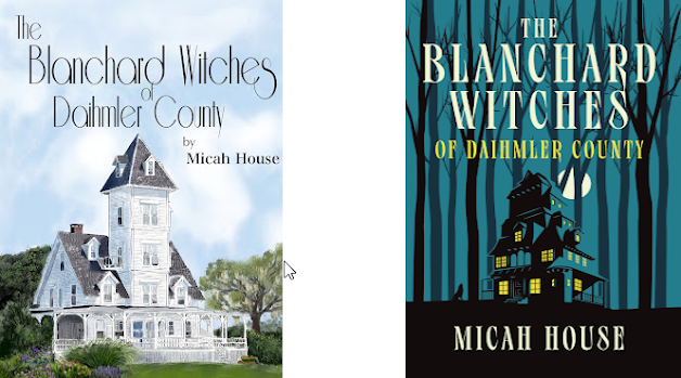
The Difference a Book Cover Makes
When I first self-published THE BLANCHARD WITCHES OF DAIHMLER COUNTY I did not know how to come up with my cover. The Blanchard family is vast with several members, each with their own specific struggle and storyline. Choosing a character's image for the cover did not seem fair. Yes, Olympia is the matriarch but her daughters Demitra and Artemis are not simply background characters. Her grandchildren Beryl, Salem, Seth, Fable, and Yasmine each have their own unique plots within the pages as well. there was no clear choice as to who the star of the book would be.
I could have gone with a witchy theme cover, but my book is different than many in the genre. It is not at its base a story about witches. It is a story about a family. If you were to remove all the magical elements of the story I feel like it is still a compelling tale of love and struggle. Choosing a supernatural look to the cover would make the book feel gothic in nature, when at its root it is a southern soap opera with the supernatural sprinkled in.
So when it came down to making a cover choice, I chose the house. Many books, especially southern style ones, use the central home as the cover. However, I chose the house because the house itself is a character. It is never referred to as "the house" or "the Blanchard's home". It is almost always referred to in first person as Blanchard House. It isn't alive. It isn't magical on its own, but it is central to the heart and core of this family. It was the only choice in my eyes for the initial cover when I released the book on my own.
As the book gained popularity on Amazon and through word of mouth, I knew I had reached all the audience I could on my own. When a publicist read my book and fell in love with the story, he suggested we make a change to the cover. He felt that the cover I chose did not go far enough to convey the proper feeling nor catch the eye. (He also helped me to see I chose a terrible font making the title difficult for some eyes to decipher). We hired a professional book designer (Paul Palmer-Edwards) who shared my belief of the house being a central character. His vision of the new cover was everything I hoped for. Yes, the house changed a bit--but in all fairness the house he designed really fits more in line with what I describe within the book.
It is funny how the same book, with just a little professional help, can look so different. I guess you really can judge a book by its cover.


.jpg)

Comments
Post a Comment